Tuesday, 2 April 2013

Reflection

Was it a success?

Through my initial prototypes and then into my final prototype I feel that I have covered most if not all of the requirements set at the end of my research. This means that from all the data gathered from my research I have been able to design a Healthy Information Eating System which meets the needs/goals/tasks/expectations/opinions of my intended user group. Its because of this that I feel that this project has been a big success. I think that my HEIS design is engaging, informative, original and most importantly its usable and accessible by wide range of users which in this day and age is an important aspect. I have covered all functional requirements and my design of the interface is intuitive, consistent and user-friendly.

What I couldn't mention in my design is the environmental requirements as these things aren't the interface itself. If this design was to be taken forward and used to build a real system then the screen for example would need to be adjustable, no glare, height adjustable etc for users who may have difficulty using such a system. This would allow wheelchair users to be able to interact with the system in the same way as any other user. This accessibility combined with my GUI design would make a usable, informative and engaging system.

Next time

If I was going to carry out a similar project in the future I think that there are certainly some improvements and things I would have done differently.

  • I personally feel that more interviews would have given some further insight into things that I may have missed or could have added.
  • I think if I was able to research into a larger user group with different characteristics the system could have been better.
  • I think I would have benefited from creating multiple personas/scenarios from the interviews so that the detail of the research was richer and possibly attract a wider spread of people to the system.
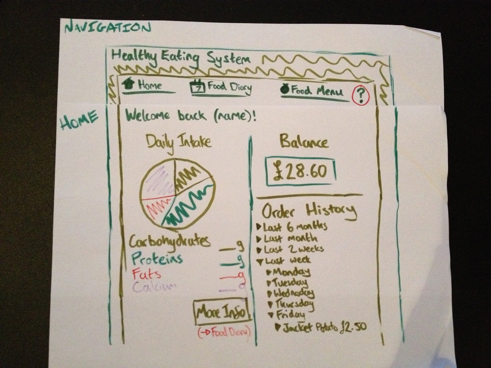
  • I think that I could have created a few more lo-fi prototypes to try out different layouts and structures as it was almost instantly that I found a layout and just stuck with it, not that it was a bad layout but it could possibly have been improved.
  • A final design in Photoshop would have been more professional however this would probably be the next stage after the hi-fi prototype.

Prototype Design: Hi-fi Final Prototype

Following my last prototype I was able to gain some feedback from my tutor before creating my final design. This was a great way to identify any final issues that could be addressed before the final design has been created. There wasn't too much to improve however I decided to add a few more bits to meet more of the requirements set out in my initial research. My feedback was the following:

  • Order history possibly taking too much space up, not that important.
  • The menu needs to be the main section of the food menu page.
  • The food log isn't clear about what day its showing.
  • Little more personalisation could be included.
Taking these important points into account I set out to create my final prototype again in Balsamiq because its a great tool for creating aesthetically pleasing mock-ups.


Click to Enlarge

Login
Although it wasn't on the specification I decided to create and design the Log In screen. One of the requirements in my research was "Consistent and Intuitive layout/navigation (repeated steps)" therefore I felt that by creating the Log In screen it shows consistency across the Information System and therefore meets the expectations/demands on my target audience. This page also shows that the swipe card technology requirement has been covered as users can swipe their card over the screen to log in or if they have forgotten their card they can log in using their UWE details.

Click to Enlarge

Home
As you can see I've added a bit more functionality detail just so its clear what things do when you click them. I've brought the order history back to the home page but its just a button don't worry! You can then click this button if you wish and the history would then be shown. I've also shown how the colour picker works at the bottom left which is a nice personalisation touch. You will also notice that I've added the date, time and a welcome (your name) section which again adds a nice personal touch which was part of the feedback. There is also now a logout button which would take you back to the log in screen above.

Click to Enlarge

Food Diary
Again not much has changed from here as it works well already and gives the user the information they want clearly and graphically. I have added the order history section to this page also as it made sense but again its just a button which the user can then click and find the information if they desire. The feedback this week also suggested that the food log was unclear about what day it was on so the date and time section as the top of the page clears that issue up neatly.

Click to Enlarge

Food Menu
This page I have changed a lot since the last prototype as the feedback I got highlighted this as an issue. I decided to take the recommendations section and stick it in the bottom right so that the user can see them if the like but its not the main thing they see when they get to this page. The user can now select the food items that the cafe is selling on the right side of the page and then when they click an item an image and full description of the product is displayed top right. This ensures that the user can find all the nutritional and allergy information about all food before ordering it which is very important as found in my research. The top right also gives you the price and order button.


Prototype Design: Hi-fi Prototype 1

I got some feedback on my Lo-fi prototype which allowed me to then make a lot of improvements for the first hi-fi prototype. The points that needed addressing were the following:

  • Identify exactly what the users want when they first log in to the Information System. The homepage needs to meet their expectations.
  • The user would want a more personal feel in the Information System.
  • Its too cluttered with information.
  • Create a prototype for all the pages.
  • Identify the key information from your requirements to ensure you cover all content that the user wants from the system.
  • Set the colour scheme.
I then created a new prototype using Balsamiq to improve on the lo-fi prototype and amend the improvements listed above from my feedback:

Click to Enlarge

Home
The 'home' page I really liked and the only thing I changed on here from the first prototype was the bottom right area. Initially I had the order history section here however from my feedback I decided that when the user first logs in that information isn't what they would be wanting. Therefore I decided to create a specials section that would have information on what the OneZone cafe was selling. I also used green and red colours to indicate whether the meal price is in budget for the particular user. This means that the user can set up allowances of their money to be able to keep on track of their expenditure. This was a key issue from the research therefore I stuck it in. You will also notice that I have included a colour picker function at the top-right hand side which allows user to choose the background colour of the system, this adds a bit of customisation and makes the system personal to the user. The colour preference would be saved for the next time they log in. I decided on my colour scheme as my feedback suggested I did this for my next prototype. I chose this light shade of green as it just says healthy eating all over it and fits into the whole design accurately.

Click to Enlarge

Food Diary
This page hasn't been changed that much from the first prototype as all the information is on here is something the user would want to find and its displayed in an effective graphical way so that the information is more interesting to read. Also from the feedback from the first prototype I was aware that my interface needed a cleaner and less cluttered feel so I kept detail to a minimum and I think this new prototype has a modern fresh feel and each section is easier to read as a result. The feedback also confirmed that the needs and goals were a great idea as it allows flexibility for the user and their healthy eating doesn't have to be strict.

Click to Enlarge

Food Menu
My first prototype didn't have this page as I thought that it wasn't going to be anything fancy just a menu. However through my feedback from my tutor I realized that designing each page would be effective and I could integrate a lot into this page. Therefore I decided that the order history section could be placed here as it was more appropriate as my first prototype had it on the homepage. I created a section called recommendations which is a great way to help the user stay on track with their healthy eating. This section works by calculating your current food intake for the day so far and finds all the meals that the cafe is serving that will be healthy and not exceed your daily allowances. This system also ensures that you don't go over your budget either. From this page you have the full menu as well at the top right where the user can order anything the cafe is serving.


Prototype Design: Lo-fi Prototype

With my requirements in front of me I started to draw out my initial design using a pen and paper. I've used this method before when creating wire frames for websites and find it useful as its so basic and gets your head around what needs to go where. This lo-fi prototype was a good starting point as I started to set out the navigation elements and designed the 'home' page and 'food diary' page.

Click to Enlarge

Navigation
This was my initial navigation design which involved 3 elements so that its simple and easy to get around and find the information that you want. The colour scheme right now isn't set however a shade of green will be used as the main colour.

Click to Enlarge

Home
This is the 'home' page which has a number of features on it such as current balance on the system, which is used to order and purchase food. This was an aspect taken from the interviews as people were keen to be able to order and have credits (money) on the system. There's an order history area where you can look at what you've ordered in the past weeks/months. What I've also got on here is a chart indicating the users daily intake of food so far. This overview is great on the homepage as the user is immediately aware of what they've eaten and how many calories etc they have for the rest of the day. From here they can then go to the Food Diary page to get a more detailed break down. I have used a pie chart as I was aware that from the interviews and app research people engage better with diagrams and colour as opposed to a list of information.

Click to Enlarge

Food Diary
Here is the 'food diary' page which is where the user can find all the information about their intake so far and here they can also log food intake, add exercise that they have done and see a more detailed breakdown of nutrients that they have eaten. I have tried to make this data as text 'unheavy' as possible and use more diagrams like I noted above, this will engage the users more and allow them to take more from the system. Also I have integrated the 'Goals' system bottom right which allows users to add their own goals for healthy eating. This was a big aspect from the research therefore it was clear that it should be included. This also goes for the 'Needs' section bottom left which actually allows users to set their own personal needs as most students don't want to have a strict diet so there's a chance here for the user to cheat on their diet as it were. This section was also inspired by the initial research.

Research: Bringing all the Research together!

After all the research I have conducted I have brought it all together to create a list of requirements that I will base my design on. All of these requirements have been taken from the research and summarised so that all the information from the persona, interviews, app research, iPlus kiosk evaluation and everything else is used in my design process. I have broken down my requirements into categories:

Functional
  • Offer support in helping students and staff make the right meal choices.
  • Set and update goals and needs.
  • Select options, choices and recommendations.
  • Enable students to place orders.
  • Use on-line credits to pay for their meals and be able to receive a collection token.
Non-functional

Data
  • User Profiles.
  • Nutrition/Dietary Information.
  • OneZone menu prices, calories.
Environmental requirements or context of us
  • Physical: Placed in a well lit area, non-reflective screen, height adjustable.
  • Social: Multilingual language, user-friendly, enter reviews, accessibility.
  • Organisational: Training, maintenance/updates, user support (help button).
  • Technical: Swipe card technology, printer, security.
User
  • Busy students/staff wanting to improve their healthy eating.
  • System to be used on a weekly basis.
  • Familiar with touch screen technologies.
Usability
  • Memorable - Consistent & Intuitive layout/navigation (repeated steps).
  • Learnability - User-friendly, icons.
  • Effectiveness - Traffic light system, motivating.

Research: PACT Analysis

The final stage of the research side of the project was to conduct a PACT Analysis. This would help to identify exactly what I needed to consider and evaluate when I start designing the system. The PACT analysis stands for People, Activities, Context and Technologies. These are the headings that we use to cover all aspects.

Click to Enlarge
Click to Enlarge
Click to Enlarge
Click to Enlarge
Click to Enlarge

"People undergo Activities in Context using Technologies".

Research: Storyboard

The next stage was to take the persona and create a scenario which is a typical user journey that your persona would take and shows how and when your system or whatever your designing is used. The scenario allowed me to develop insight into what my target audience actually want to get from such a system and the certain moods/feelings they would have when they use the system. In this instance my persona doesn't have a lot of free time so the system has to be quick and efficient in order to meet his needs, otherwise he simply wouldn't use it.

Click to Enlarge

The journey in words:

Freddie wakes up at 9am on Monday to get to his first lecture at 10am. He grabs a banana on the way as he’s become aware of his 5 a day needs from one of his goals set by the information system. After his lecture he heads to the OneZone for lunch and logs into the information system by swiping his UWE card. He logs his daily food consumption and his recommendations for the rest of the day are shown to him. He is able to view a pie chart of his daily intake of nutrients which he finds easy to understand and act on. He then selects a meal from the recommendations and chooses to pay for his meal using the credits that his parents top up each month. He eats at the OneZone 3 times a week which allows him to keep on track of his diet and have enough money to spend on other aspects. When not eating at the OneZone he uses the app to find recipe ideas for meals and logs his daily food consumptions. This is all saved on the system for when he next logs in when in the OneZone.

Research: Personas

After interviewing the students at UWE the next stage was to create a persona based on these real students. This would allow us to ensure that we are meeting the demands of the target audience and fulfilling their needs for a healthy information system. The persona would also allow us to create scenarios which are effective when designing a GUI. Here's the persona I created:

Bio

  • Name: Freddie Jones
  • Age: 19 years old
  • Gender: Male
  • Occupation: University Student
  • Home/overseas student: Home
  • Study: Sport
Personal Information
  • Freddie is studying at UWE on the Frenchay Campus and is currently in his first year of study. He lives in the Student halls on site with 5 others. He plays lots of rugby and tries to eat a healthy balanced diet to keep him fit and energised for his sport.
  • He currently studies for 12 hours a week and then has to fit in coursework and training in the week. Because of his tight schedule he finds that making healthy snacks is difficult and often has to eat unhealthy food as its ready prepared such as chocolate bars and crisps. When he breaks for lunch he usually picks up a meal deal from the shop as its close to his lectures and practical’s and its cheap.
  • Due to his busy schedule Freddie is finding it hard to find some part time work that fits in with his routine. Because of this he finds he has to stretch his money out month to month and therefore has to buy his food as cheap as possible. The meal deal for him is a cheap and tasty lunch however he would like to eat a more healthy option.
Hobbies
  • Freddie plays rugby whenever he can throughout the weekdays and plays fixtures on the weekend.
  • He also likes to use the UWE gym on a regular basis to build strength for Rugby.
Issues
  • Freddie wants to eat healthy but finds that fresh organic foods are too expensive and time consuming to make meals from.
Goals
  • Freddie would like to be able to buy healthy meals for a price he can afford.
  • Freddie wants to try and eat his 5 a day as snacks instead of chocolate, crisps etc.
  • Freddie doesn’t know what his daily intakes of nutrients are and would like to be able to track this.
  • Freddie wants recommendation and advice on what he should be eating.

Research: Interviews

The next stage of the project was to conduct some interviews with the target audience. The Information System that I will be designing will be employed in a cafe in UWE therefore the target audience for my system is students. I asked 4 students a set of questions and collated the results into 3 categories:

Needs
  • Dietary requirements.
  • Tracking daily amounts.
  • Calorie count.
  • Healthy eating advice.
  • Fit into their current routine.
  • Affordability.
Goals
  • Eat ‘five-a-day’.
  • Awareness of health.
  • Keep to dietary guidelines.
  • Spend less on snack food.
  • Reduce weight.
Tasks
  • Use the App regularly.
  • Keep a food diary.
  • Use advice and recommendations from the system.

Research: App Insights

The next stage of the project was to look at some healthy eating apps to gain some further insight into what I need to include when I start designing my system. I looked at 2 apps and from these I was able to gather the following information which will be vital in my design process:

  • Allows you to share recipes with friends to help keep you motivated.
  • Uses keywords/categories to summarize recipes e.g. (easy, low fat, super healthy etc.) Helps finds information quickly.
  • Tracks nutrition such as protein, calories, fat etc.
  • Enter own information to make it personal e.g. food diary
  • Use of graphics to help show progress
  • Use of icons to improve navigation.
  • Simple, consistent and easy to use interface.


Research: Evaluation of the iPlus Kiosks

The next stage of the project was to analyse and evaluate the iPlus kiosks situated around Bristol. This research would give me great insights into what makes a good information system but also more importantly what doesn't and what things to avoid when designing a system.

The Evaluation Results:

Positives
  • Easy to find.
  • Use of colour to separate different parts of information was clear and engaging.
  • Use of maps to display data was slick.
Negatives
  • Touch screen response was terrible.
  • Scroll function didn't respond well.
  • Reflection on screen made it hard to view.
  • Search results didn't work.
  • Cleanliness was poor.
  • Accessibility was poor for example people in wheelchairs wouldn't have been able to view the screen.
  • Poor use of icons.
  • Printer didn't work.
  • Inconsistent layout/fonts.
  • Slow.
As you can see from my research the negatives I found certainly outweigh the positives. However this isn't all bad news as from this research I have a huge amount of information on things I should ensure I don't do with my system. For example the negative comment about poor use of icons and inconsistent layout/fonts is useful as I now know that consistency is key and good icons will help the user more. So all in all this research was great for insight.


Research: GUI Touch Screen Design Guidelines and Principals

My initial research was finding out the guidelines for such a system. The system would be touch screen and therefore there are certain principals that I need to take into consideration. After thorough research I combined the findings to make some golden rules when creating the system:

Golden Rules
  • Speed- make it fast (this also reduces vandalism).
  • Intuitiveness.
  • Choice - Less is often more.
  • Guidance - Guide the user as much as possible.
  • Testing - to find problems and implement changes.
  • Must require no user training.
  • Reduce cost of human alternative.
  • A well-designed kiosk can help increase the profits of an organization and contribute to customer satisfaction.

Welcome!

Welcome to my blog! I will be conducting a project as part of my assessment to research into Healthy Eating Information Systems where my final deliverable will be a graphical hi fi prototype of my final design. As part of the project I will be taking you step by step through my research stage initially and then on to the design stage further on. My design choices will be based on research into real existing products where I will confirm why I designed my system the way I did.